Anchor
Anchor is a focus app concept: a calm partner that reminds people what they came to do, right when distraction begins.
The challenge
Most focus tools run on discipline, streaks and guilt. Anchor had to feel kind and steady, a brand people are glad to see every day, without sounding like one more productivity app asking them to try harder.
What we did
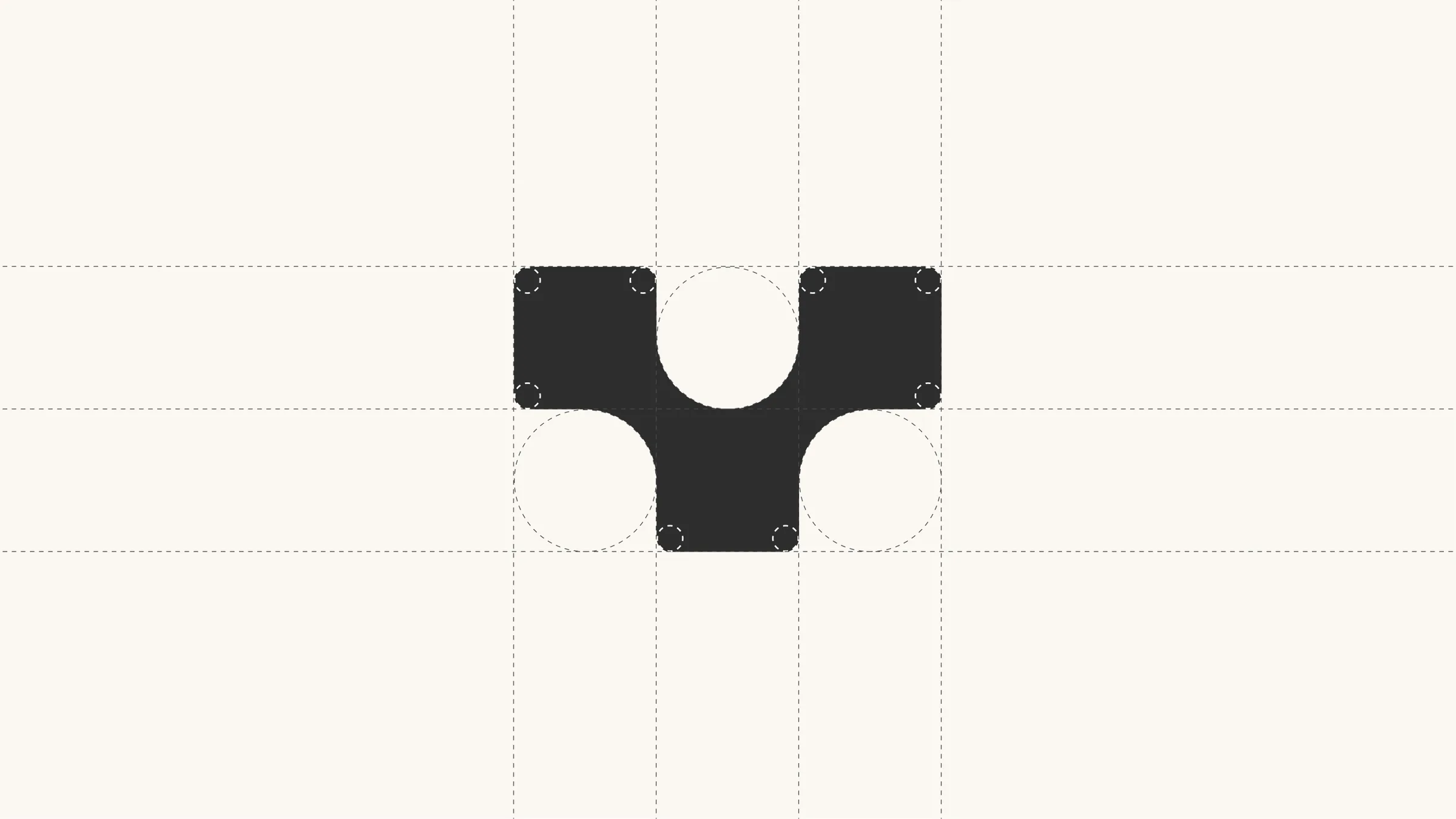
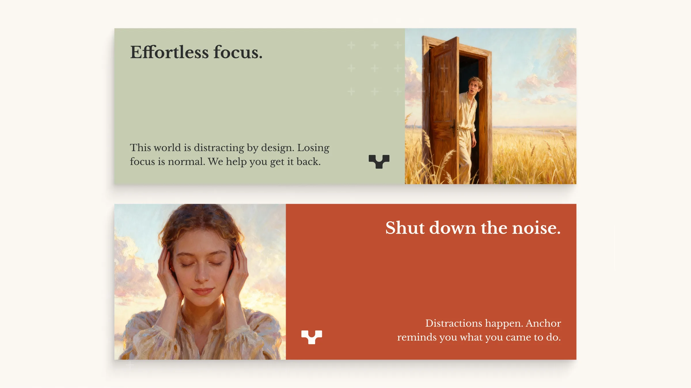
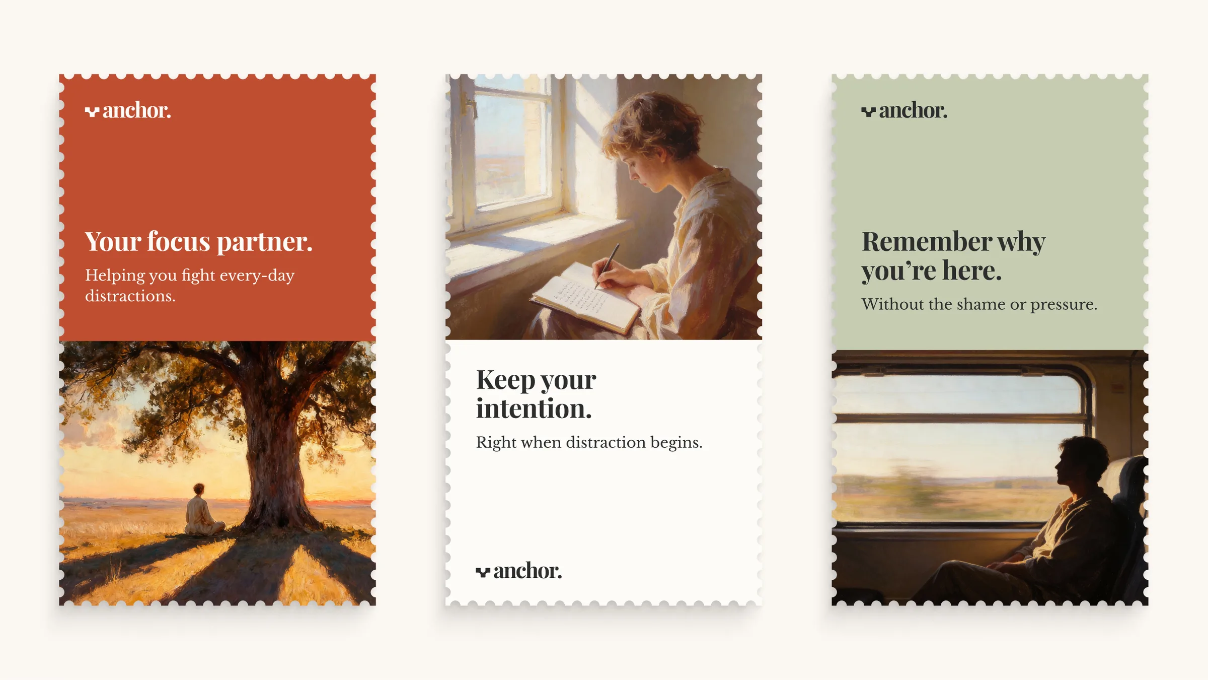
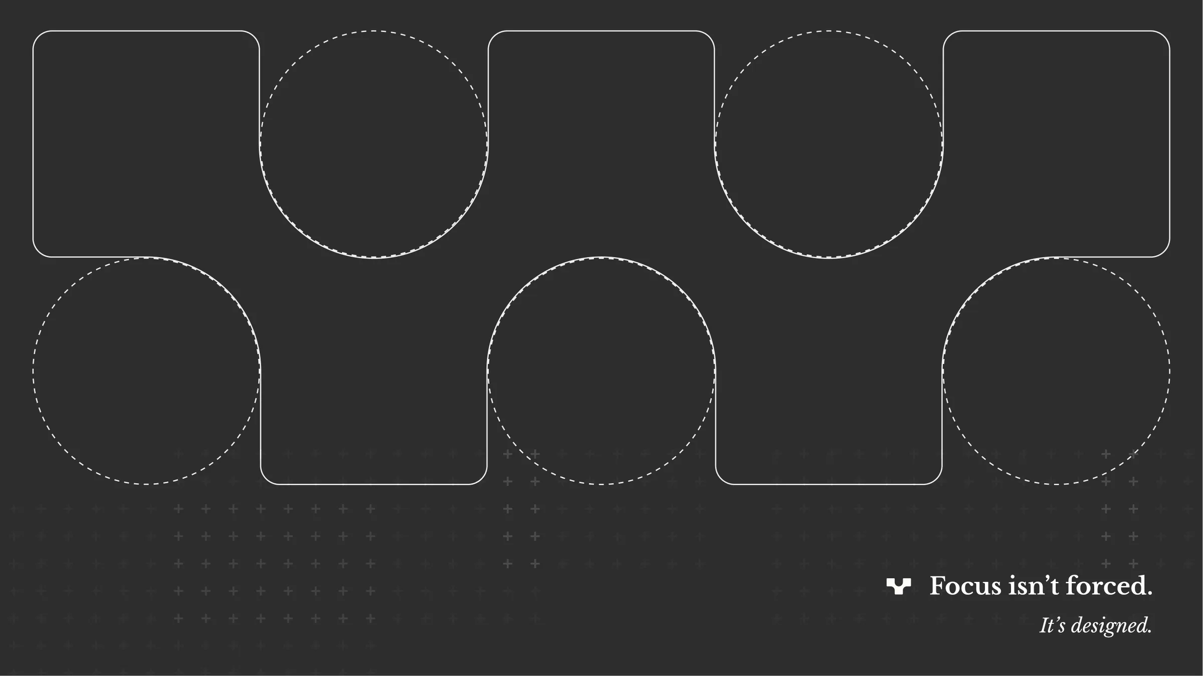
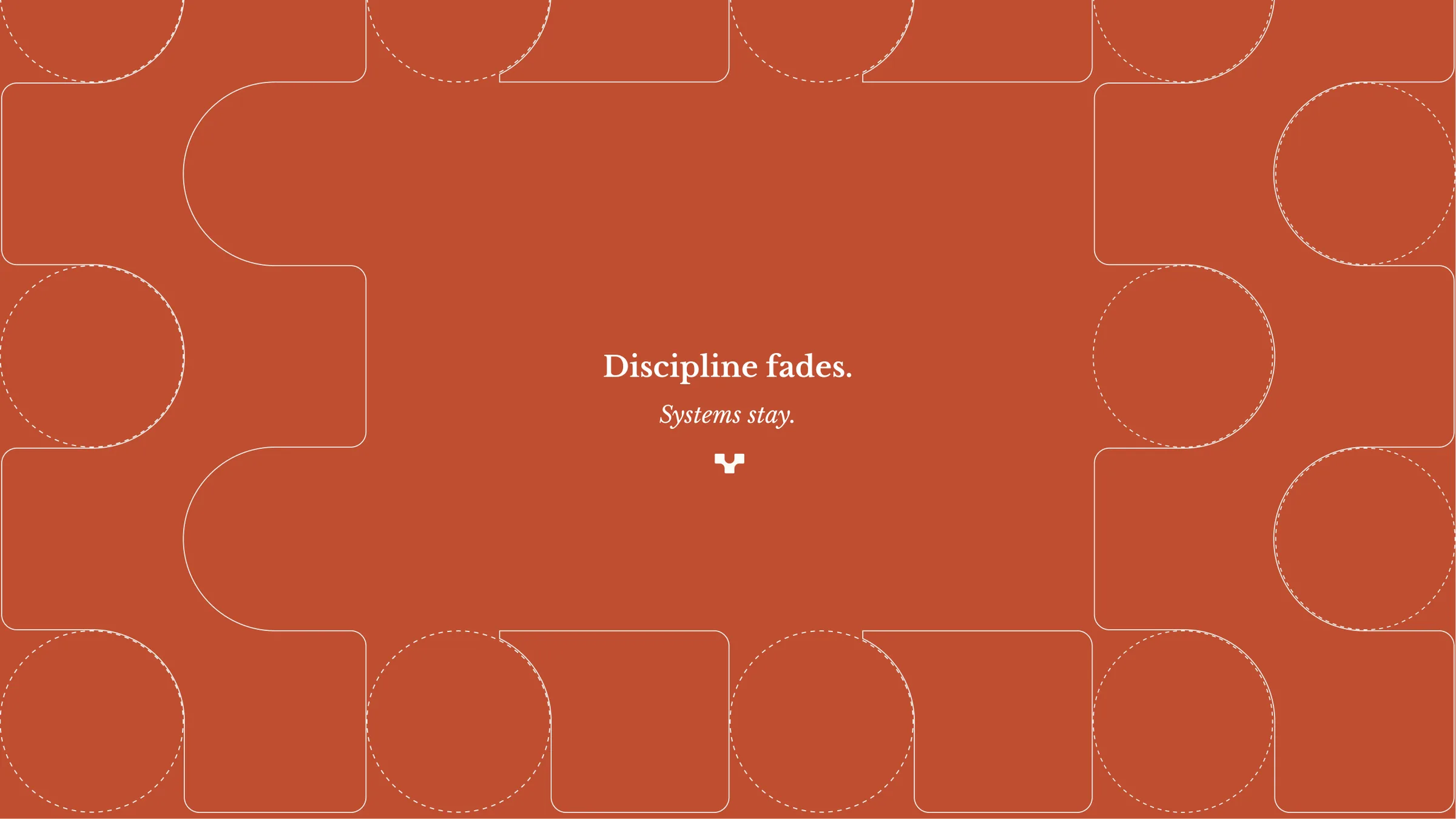
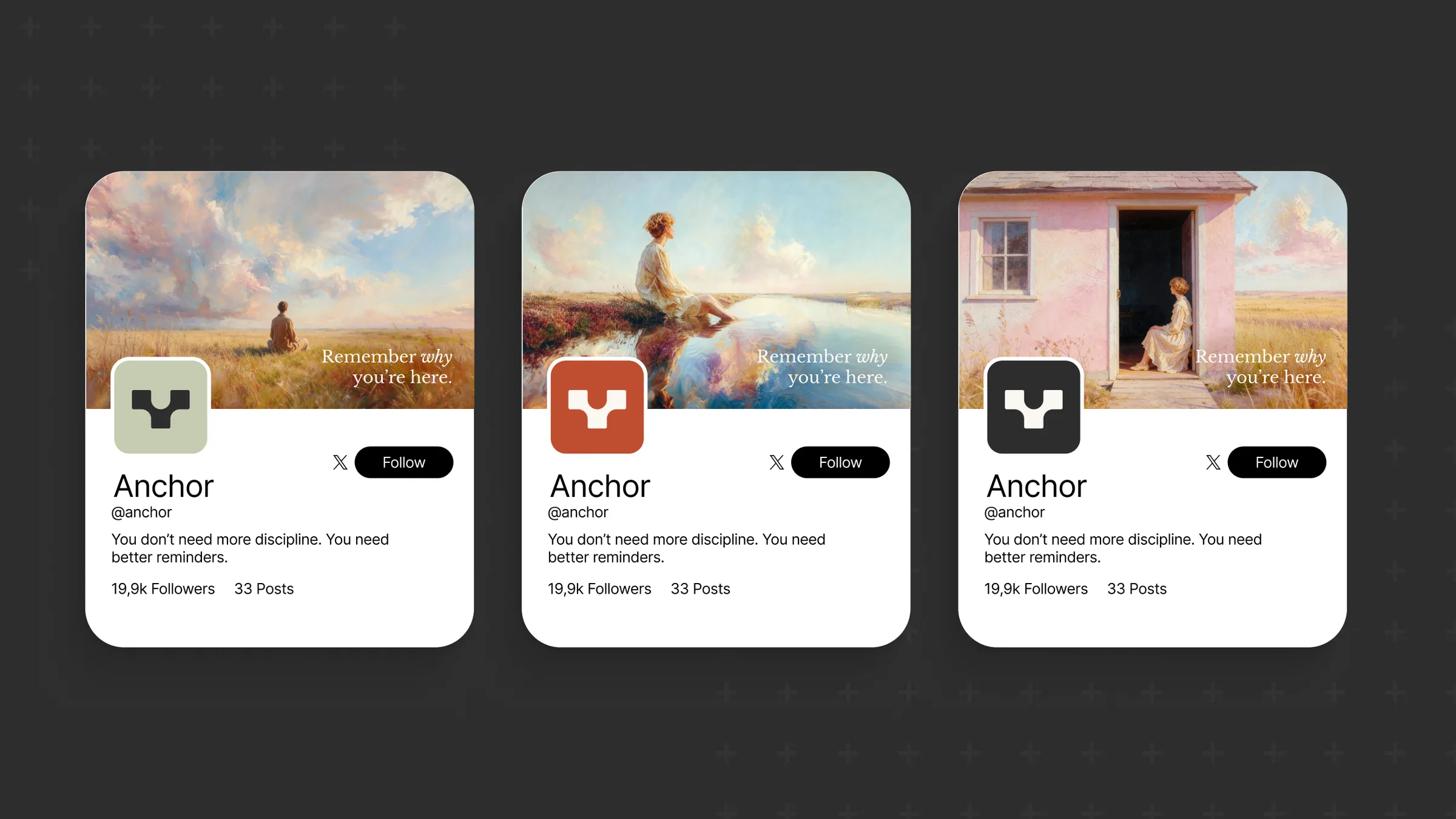
We built everything around one line: remember why you're here. The symbol comes from a grid of squares and circles, an anchor shape that also repeats as a pattern. Around it we set a warm palette of terracotta, sage and charcoal, a classic serif and painted images of people in quiet, open places.
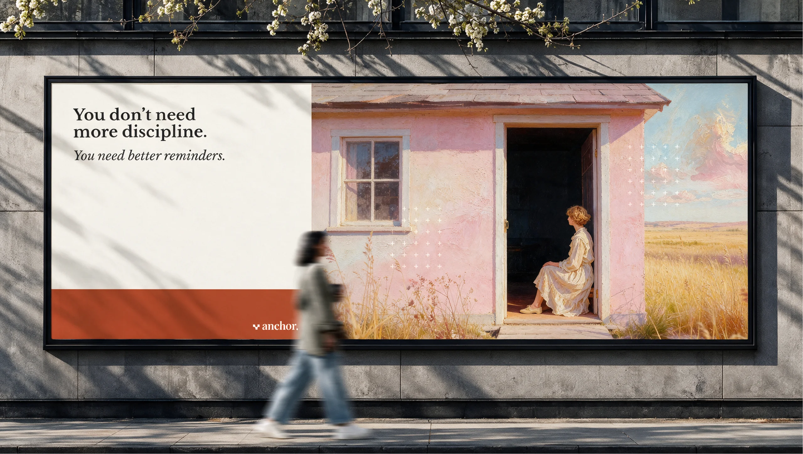
The voice keeps every message short and free of pressure: you don't need more discipline, you need better reminders. In motion, a tangle of dotted lines settles into the wordmark, the brand's idea in a few seconds.
The result
A complete identity system: symbol and wordmark, pattern, color and type, art direction, tone of voice and copy, and applications across campaign banners, posters, billboards, social profiles and a motion intro.

Next project
KNG