Supercube
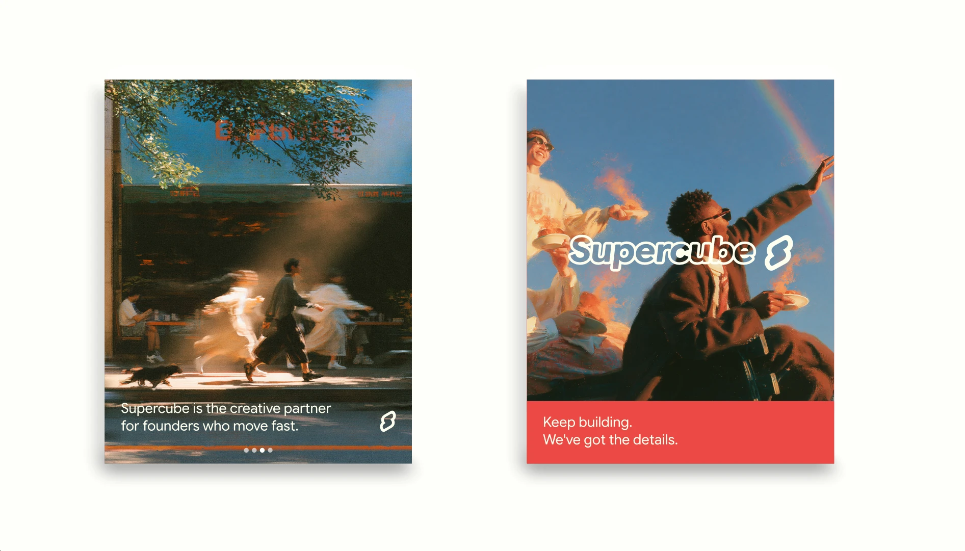
Supercube is our own brand: the creative partner for brands on a mission, built for founders who move fast.
The challenge
Our brand had to do what we promise every client: show what makes us unique and make sure people find us. It needed to bring two worlds together, design and SEO, and feel as warm and curious as the work we want to do.
What we did
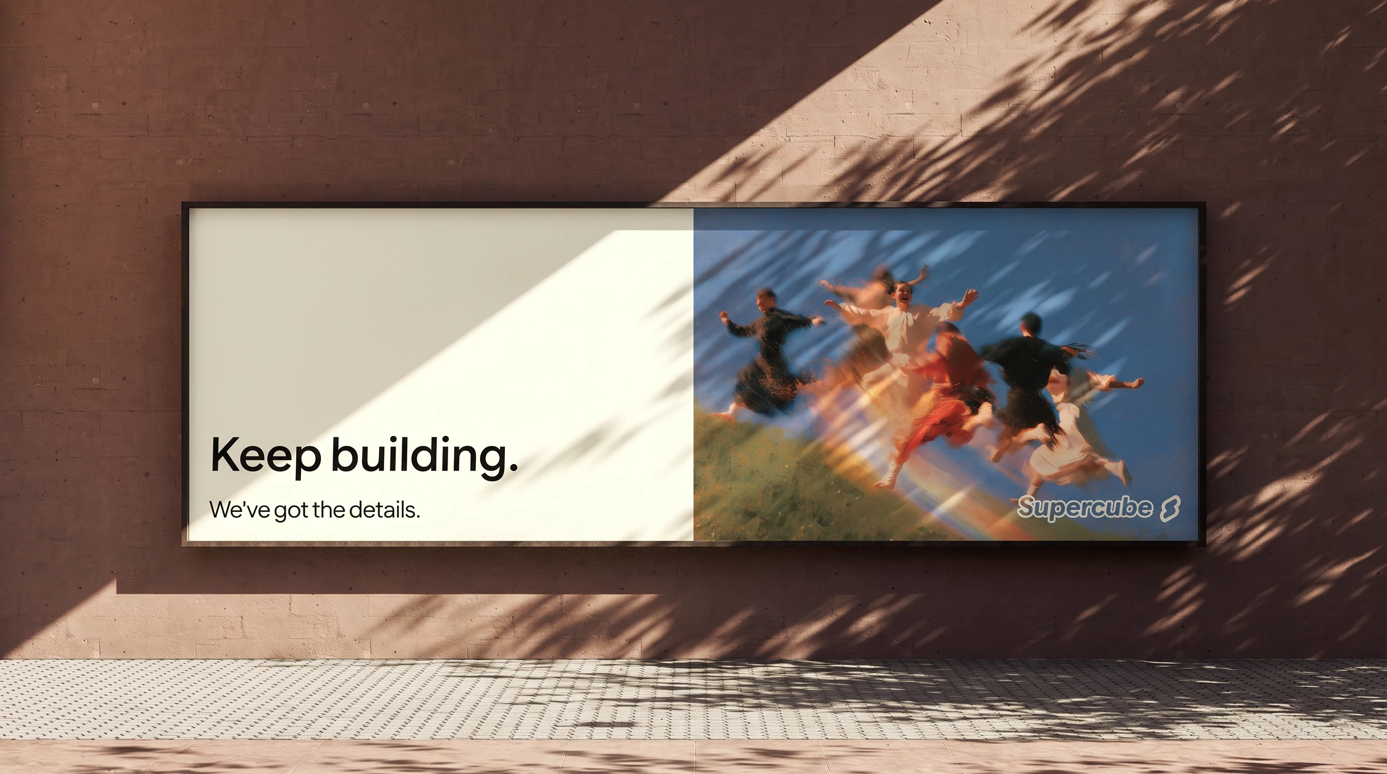
We started with the strategy: the origin story, a mission to give great ideas character, five values and a voice that is sharp and warm. The positioning came down to one promise for founders: keep building, we've got the details.
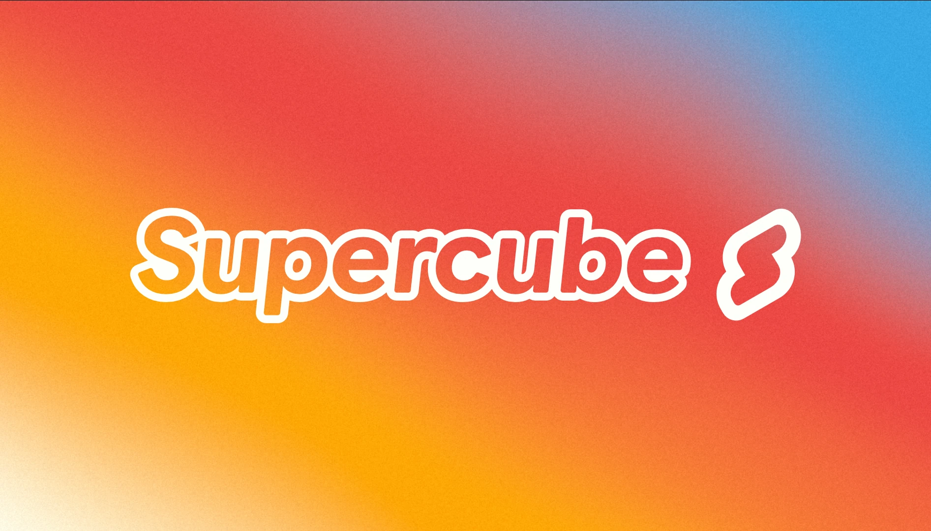
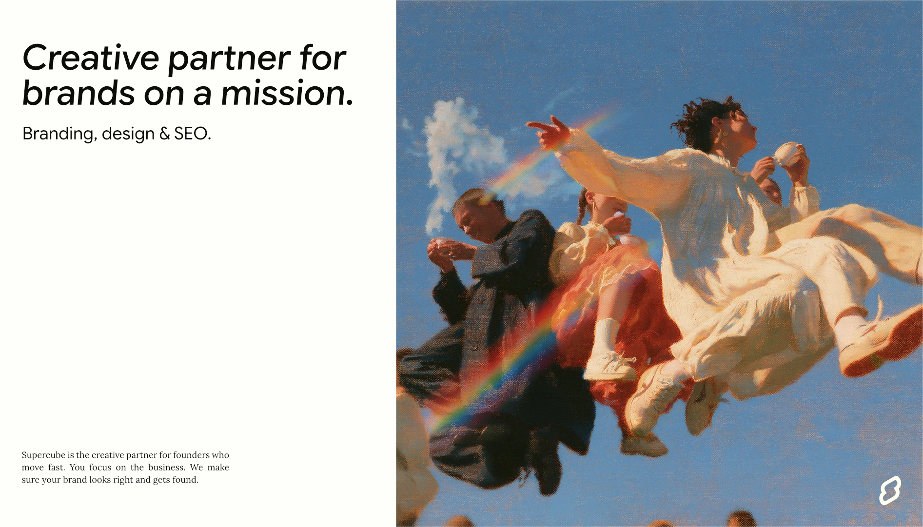
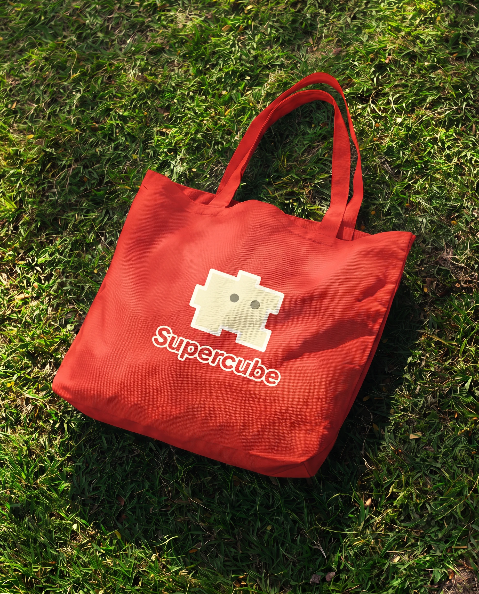
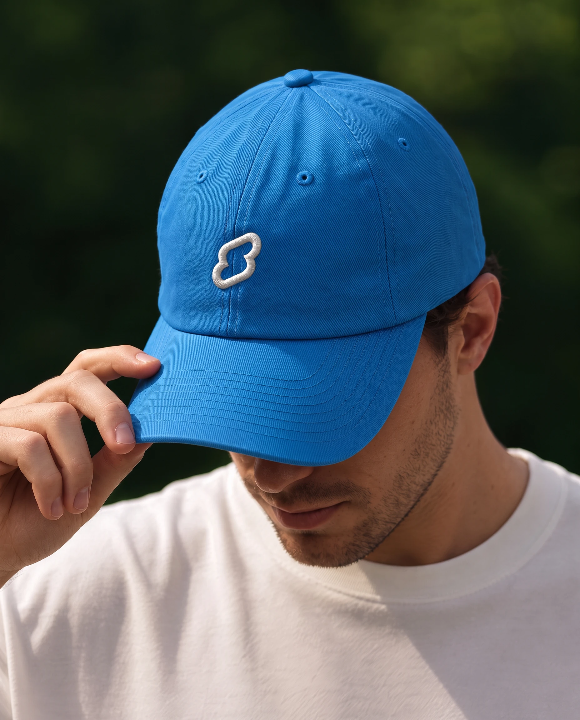
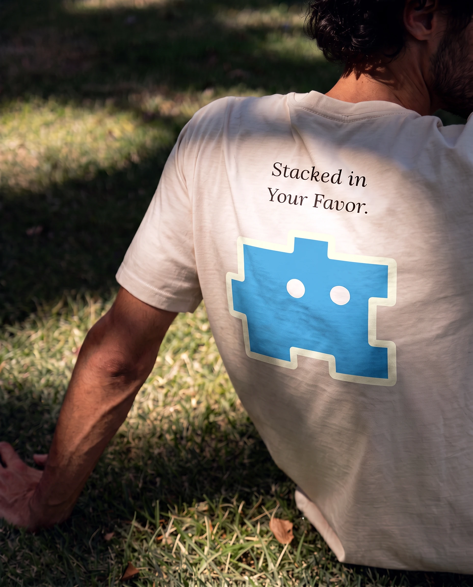
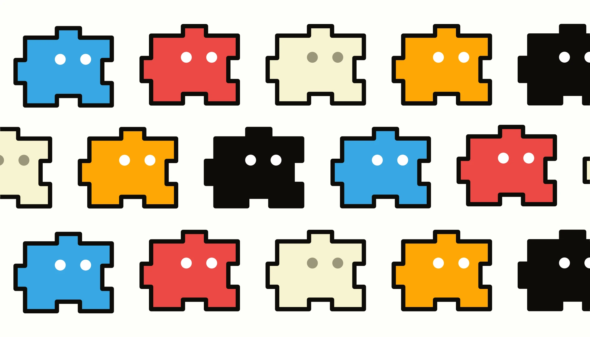
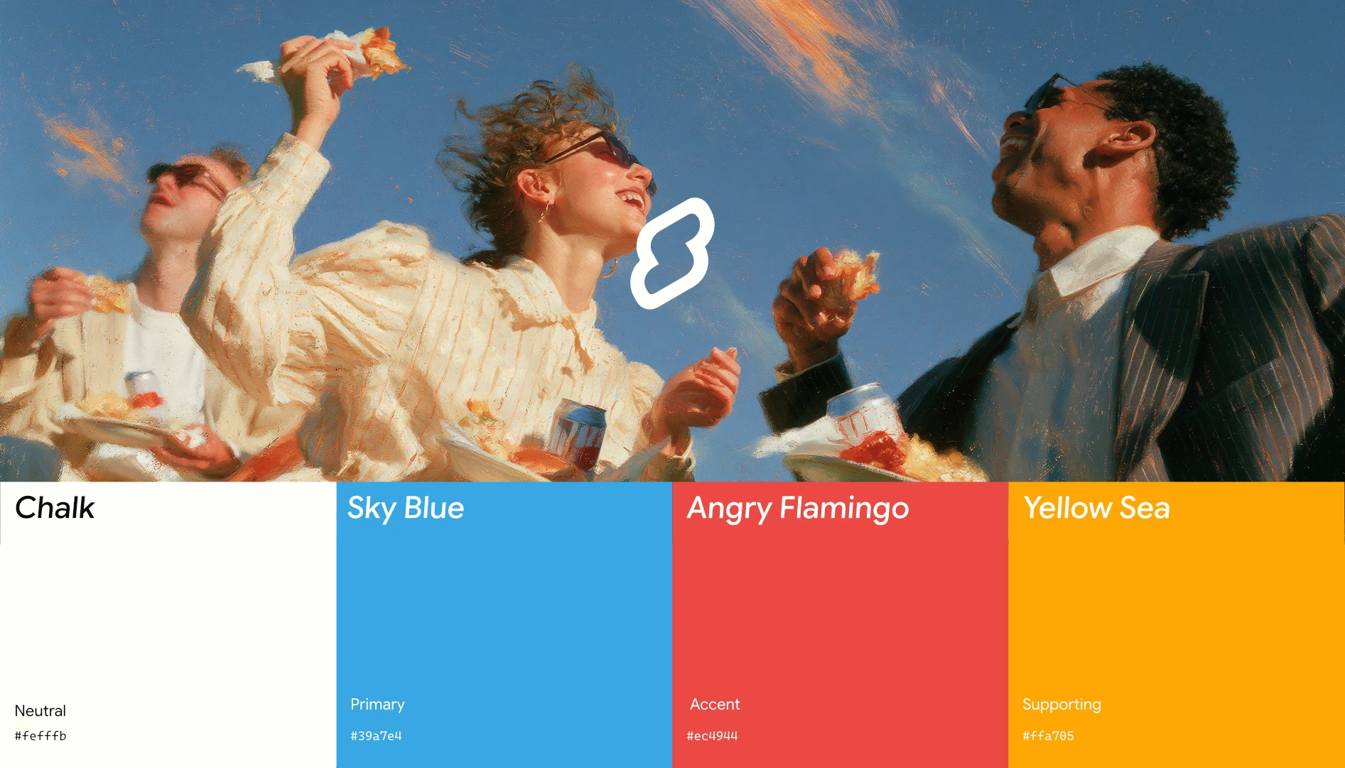
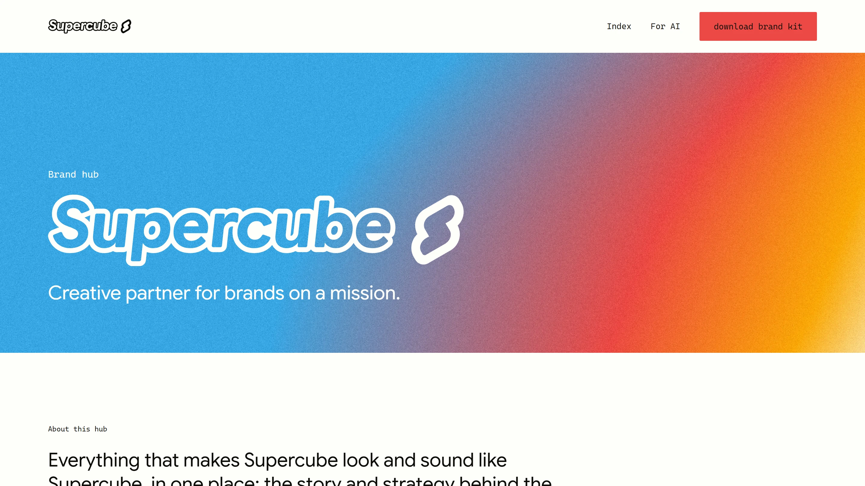
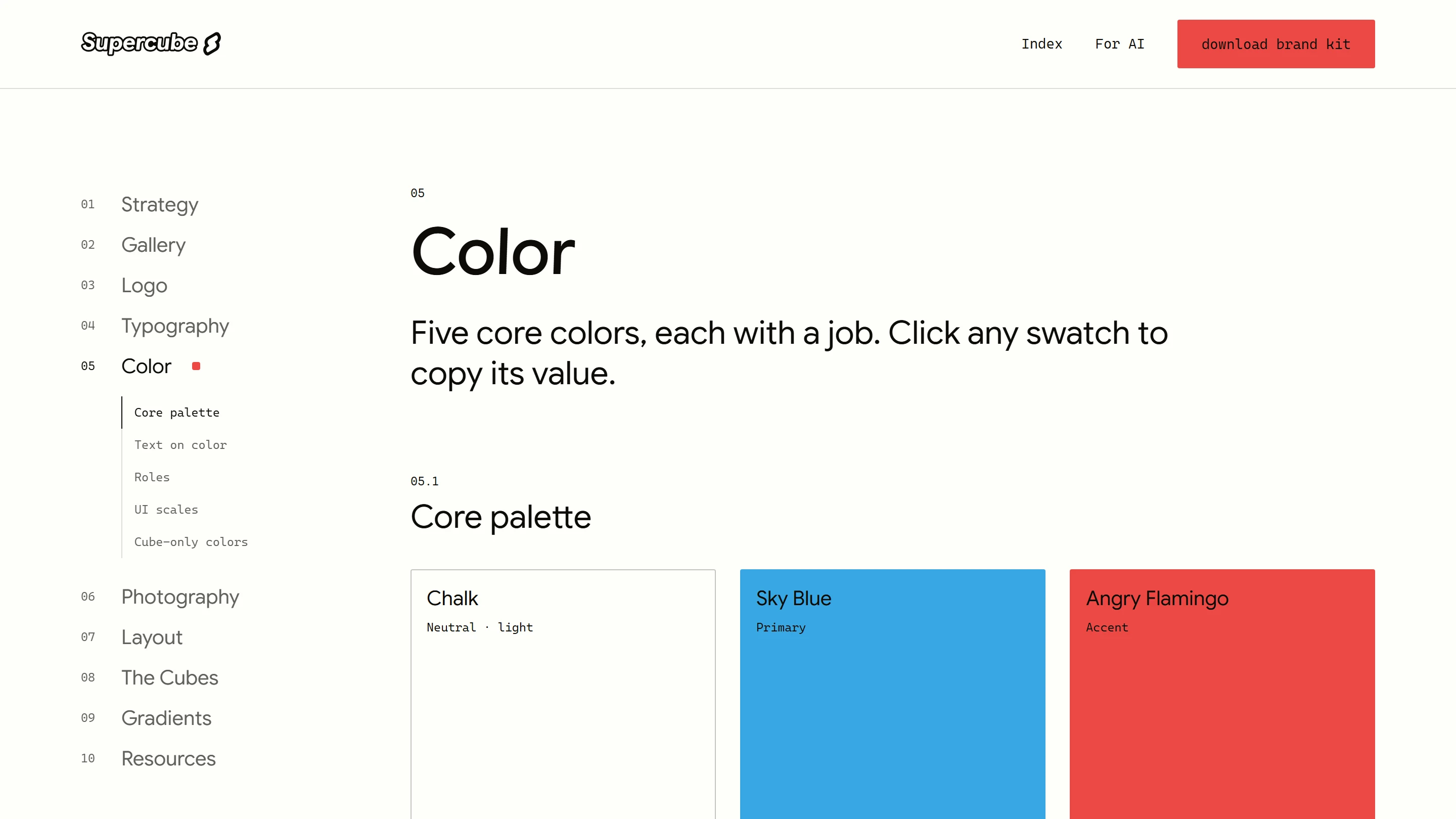
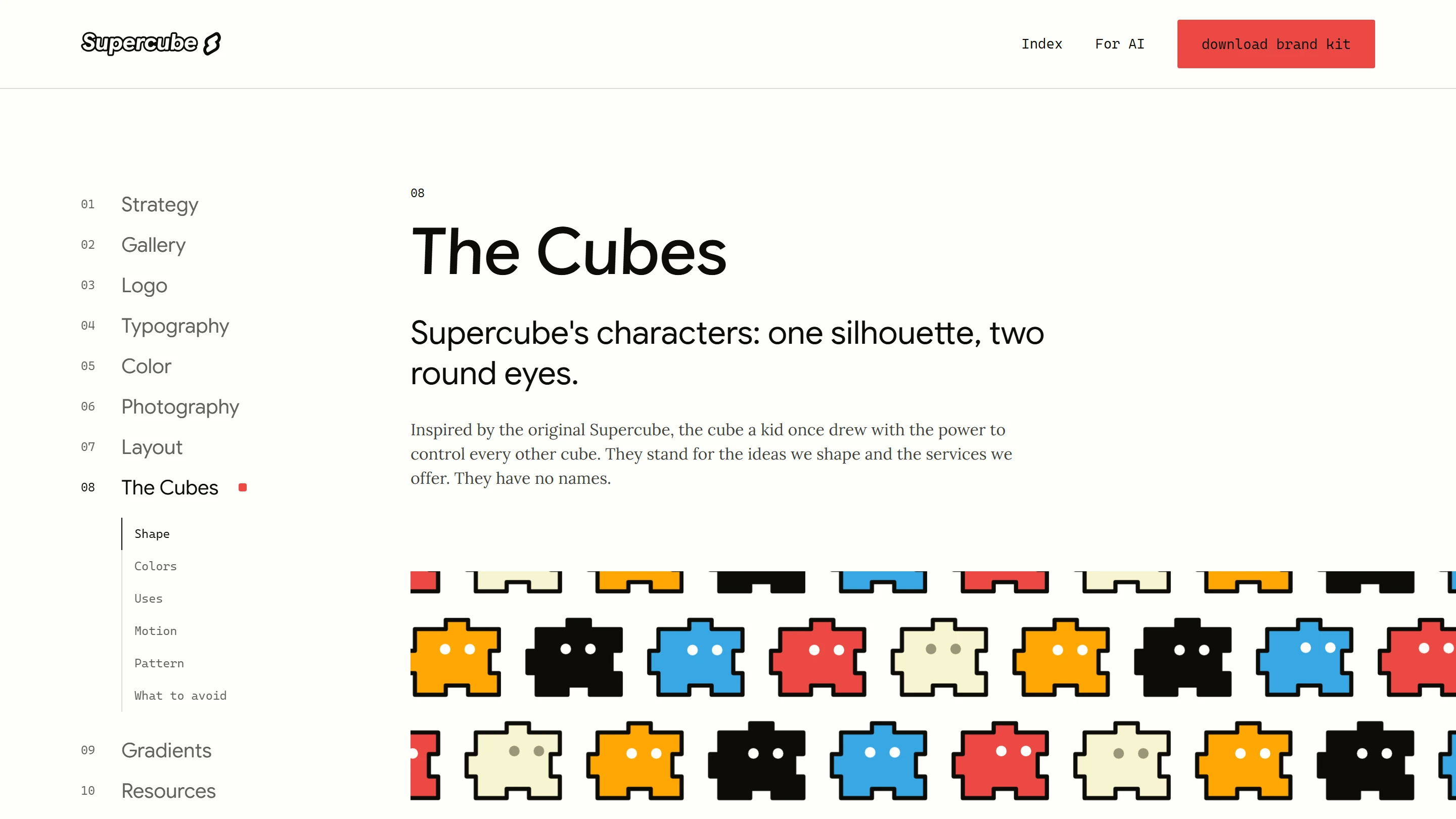
Then we built the visual system around it. A lockup with an italic wordmark and the S symbol, the Cubes as our characters, a palette of Chalk, Sky Blue, Angry Flamingo and Yellow Sea, grainy gradients, and painted photography of happy people in the sky, in nature and in the city.
The result
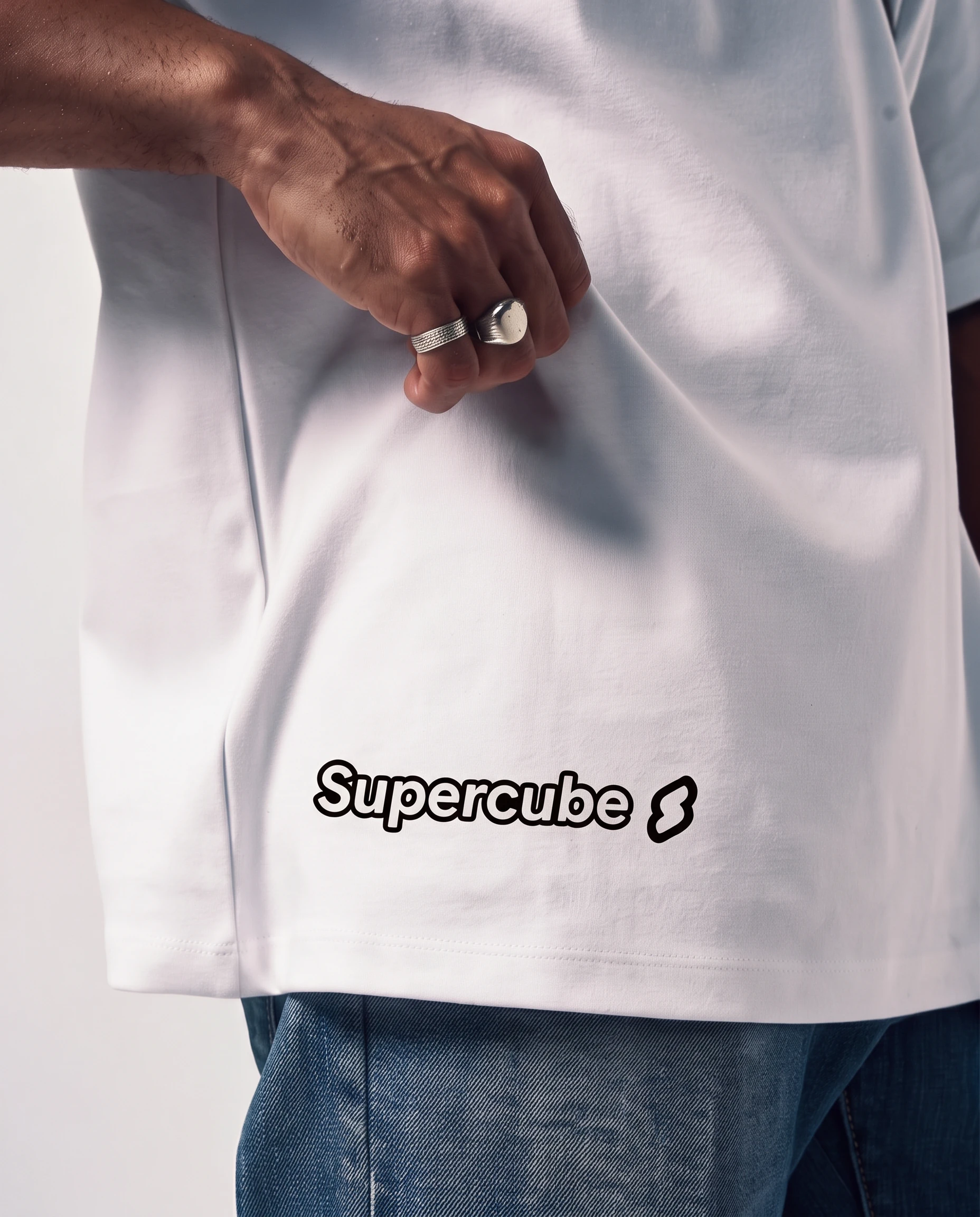
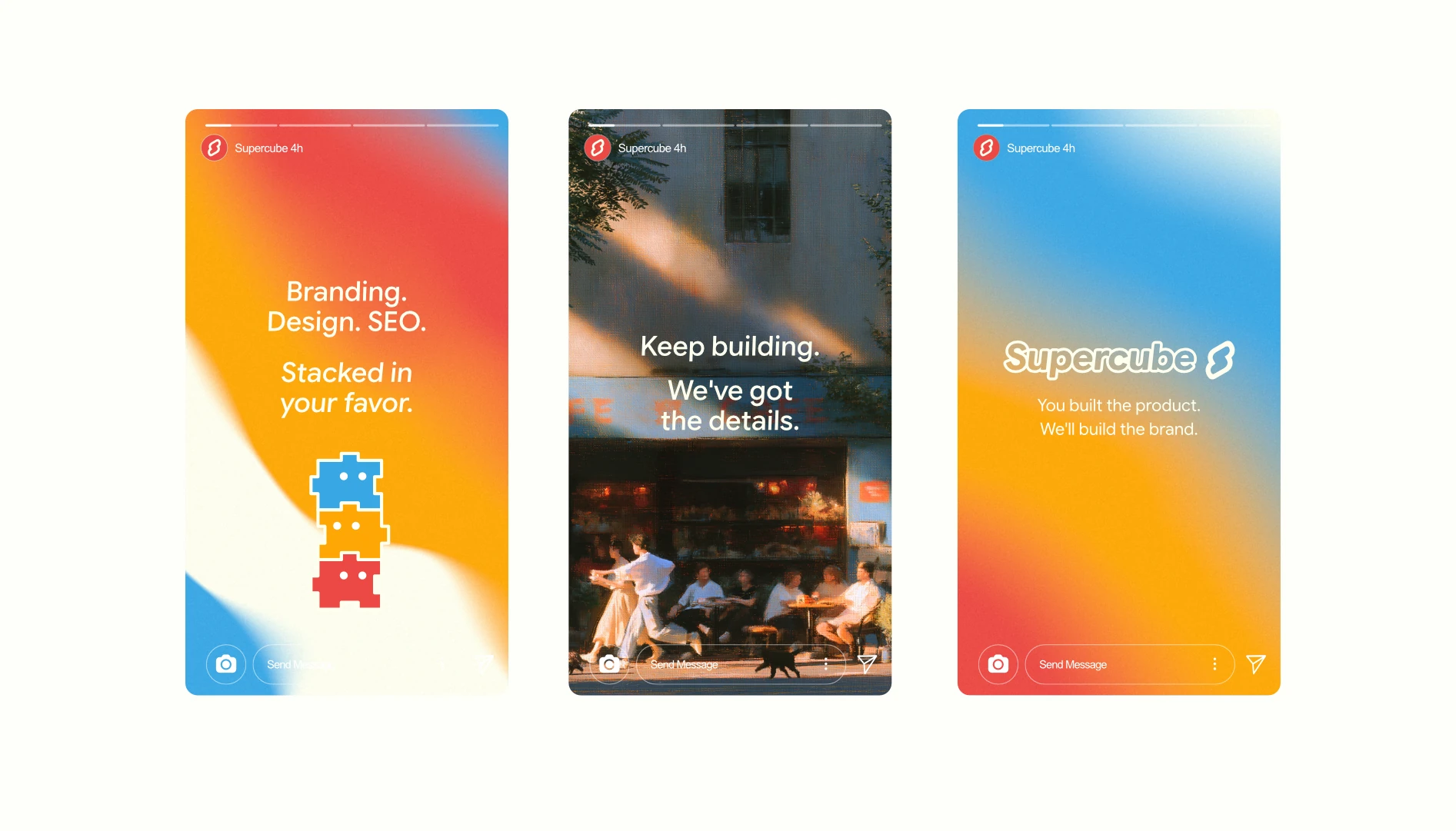
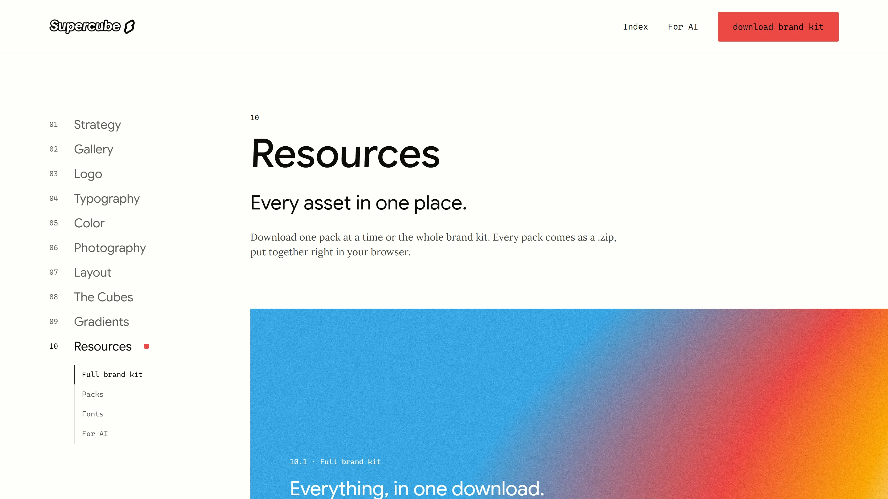
A complete brand system, documented in a public brand hub with the guidelines, the files and a brief written for AI tools. It already lives on merch, billboards, social posts and stories, and anyone on the team can build with it.
Next project
Anchor